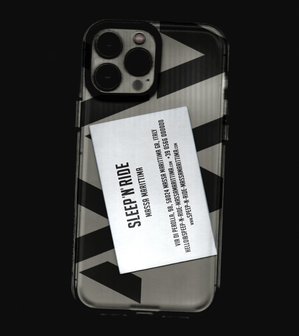
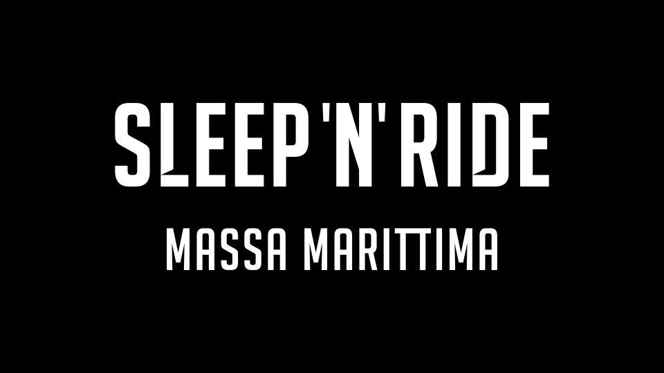
SLEEP 'N' RIDE
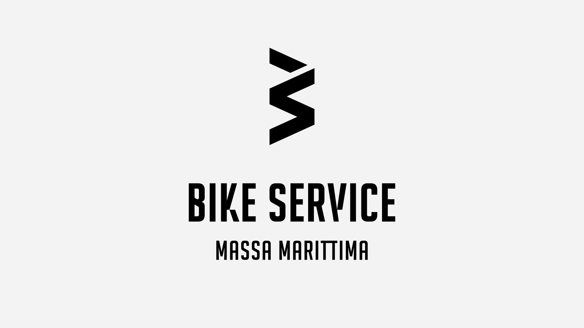
BIKE SERVICE MASSA MARITTIMA & SLEEP 'N' RIDE
Logo design for a place built on passion and trail dust
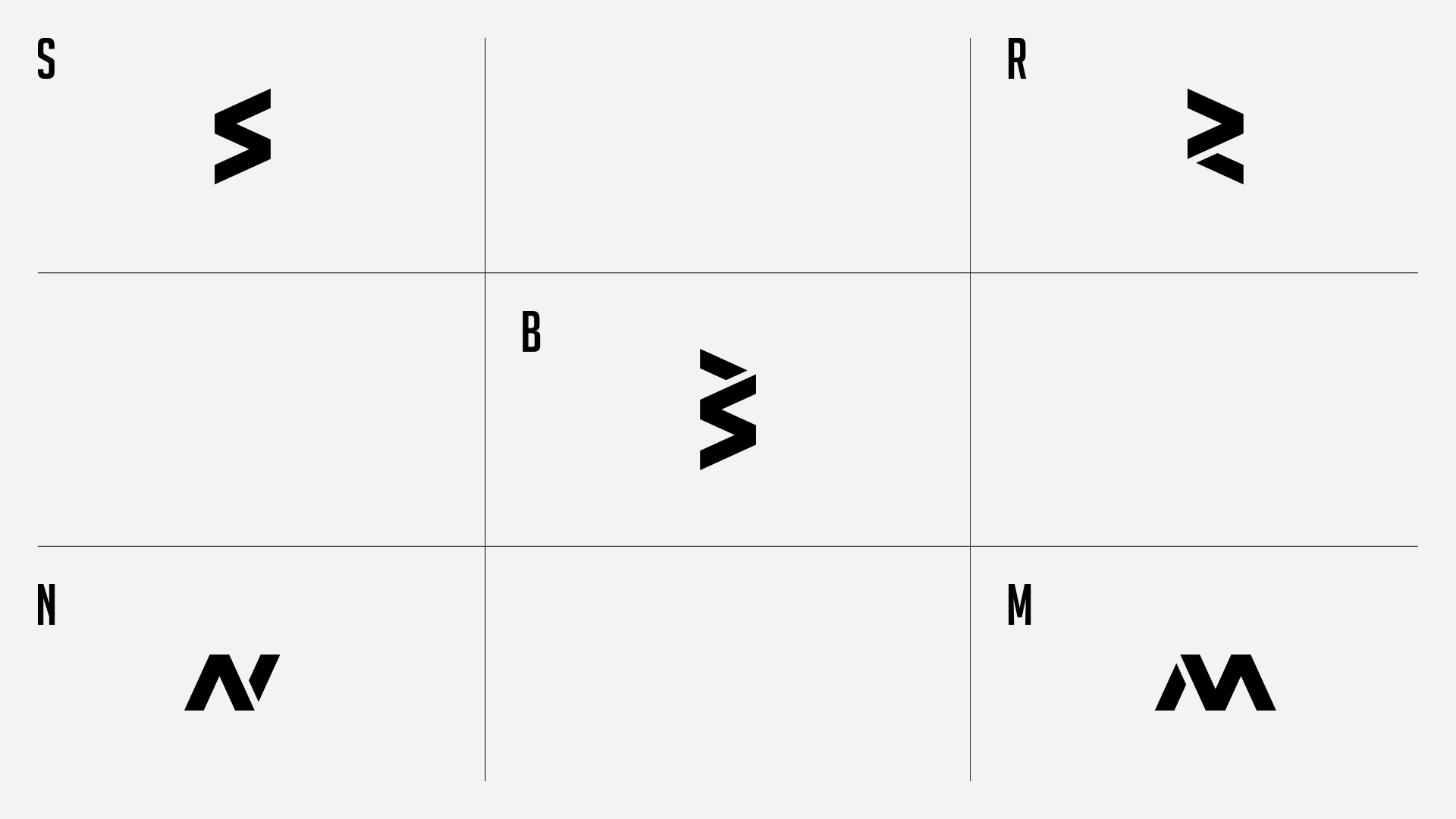
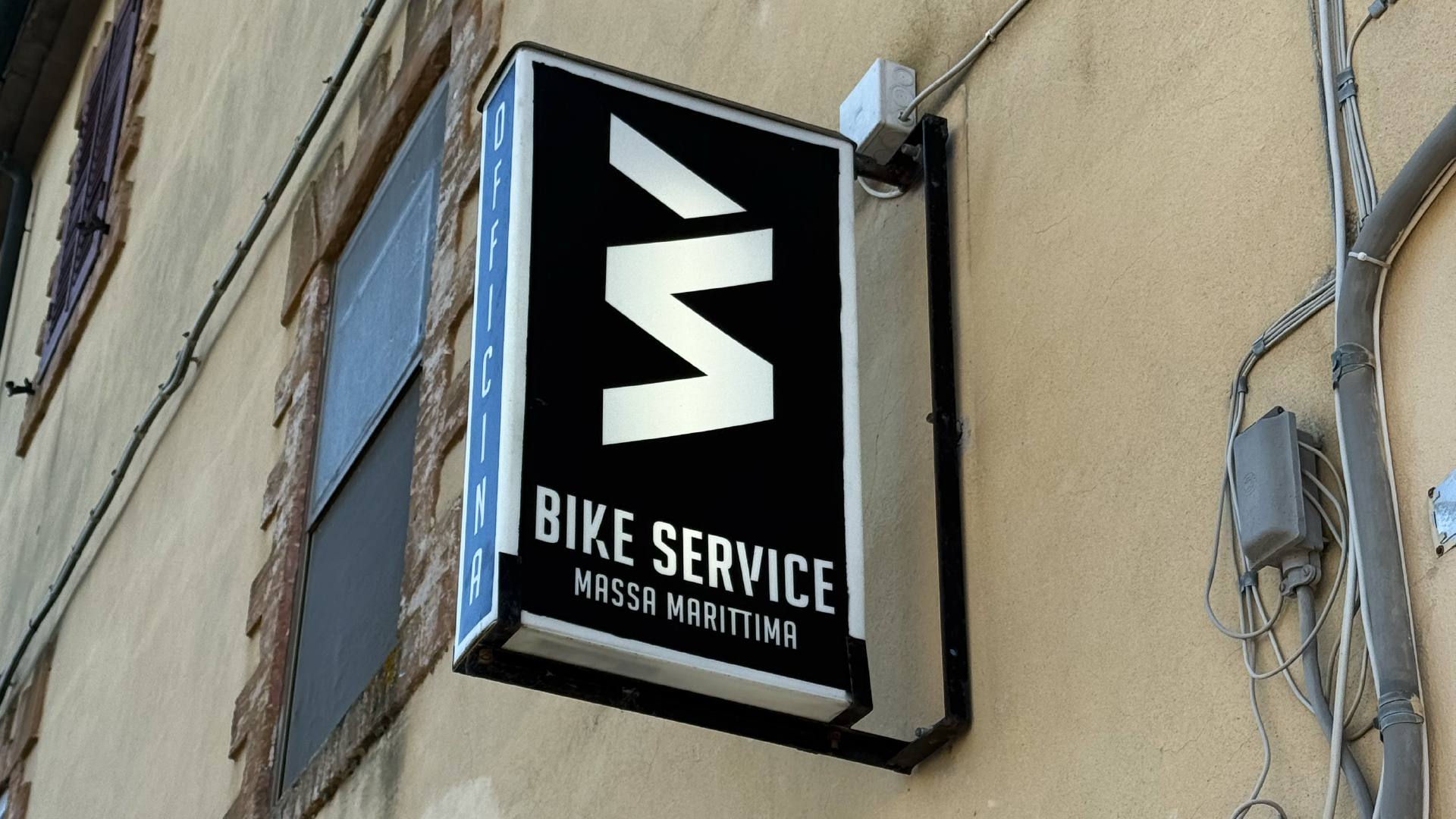
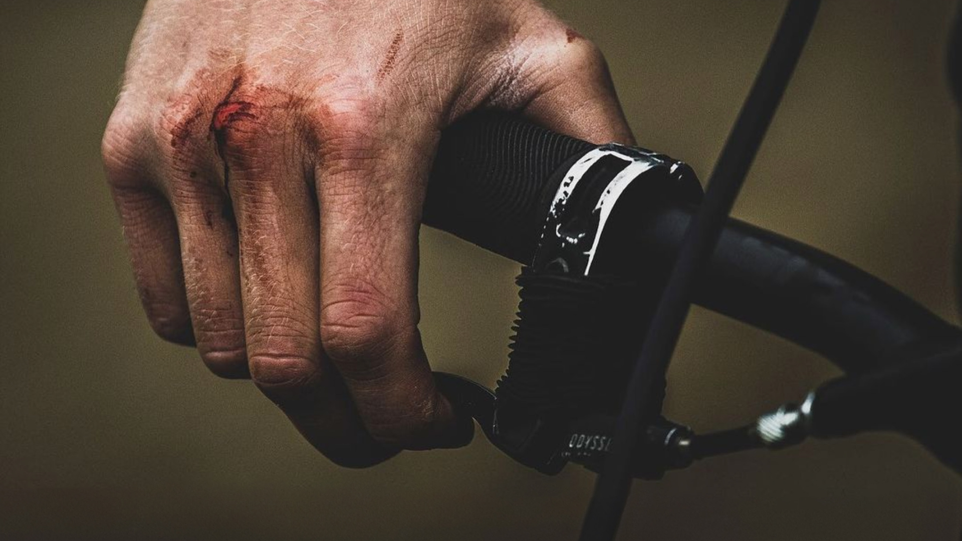
At sugototal.com, we don’t believe in decoration for its own sake. Good design should work. And feel. And stay. Ideally, it should ride. This logo project started in the dusty, sun-lit hills of Massa Marittima, Italy — home to Bike Service Massa Marittima, a full-spectrum bike shop offering rental, guides, workshop and suspension tuning, shuttle service and trailbuilding. The identity needed to be as versatile as the service: a bold and simple icon that could hold the terrain. We fused the initials "B" and "S" into a single symbol — which, depending on the angle, reveals also an "M" for Massa Marittima. It’s a mark with movement, made for stickers, signs, head tubes, jerseys, whatever. From there, the story evolved.
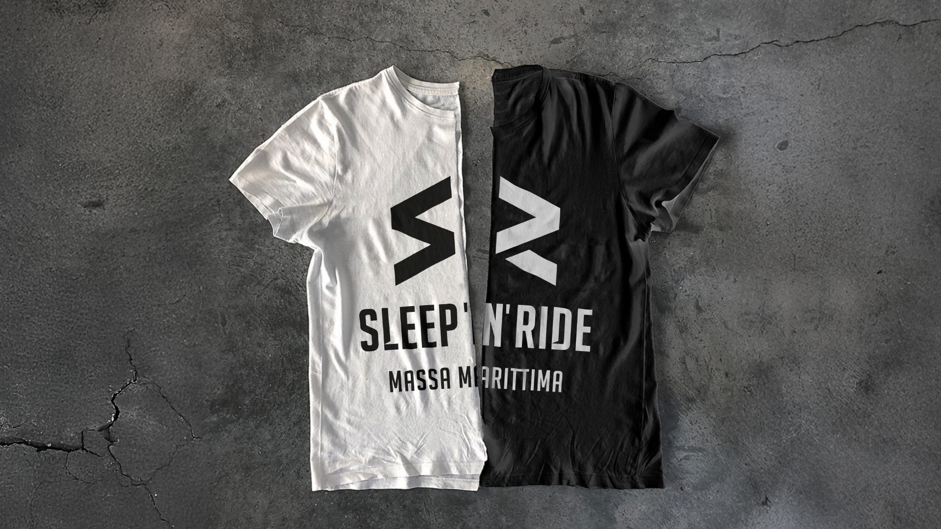
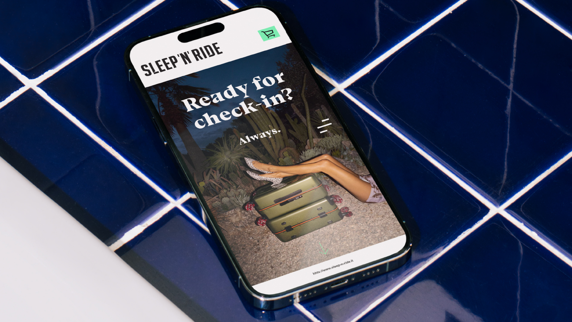
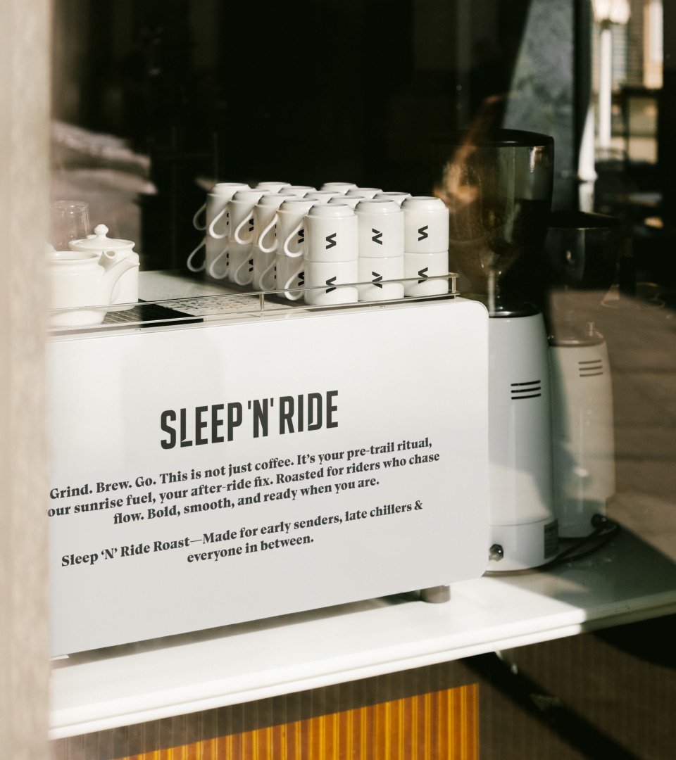
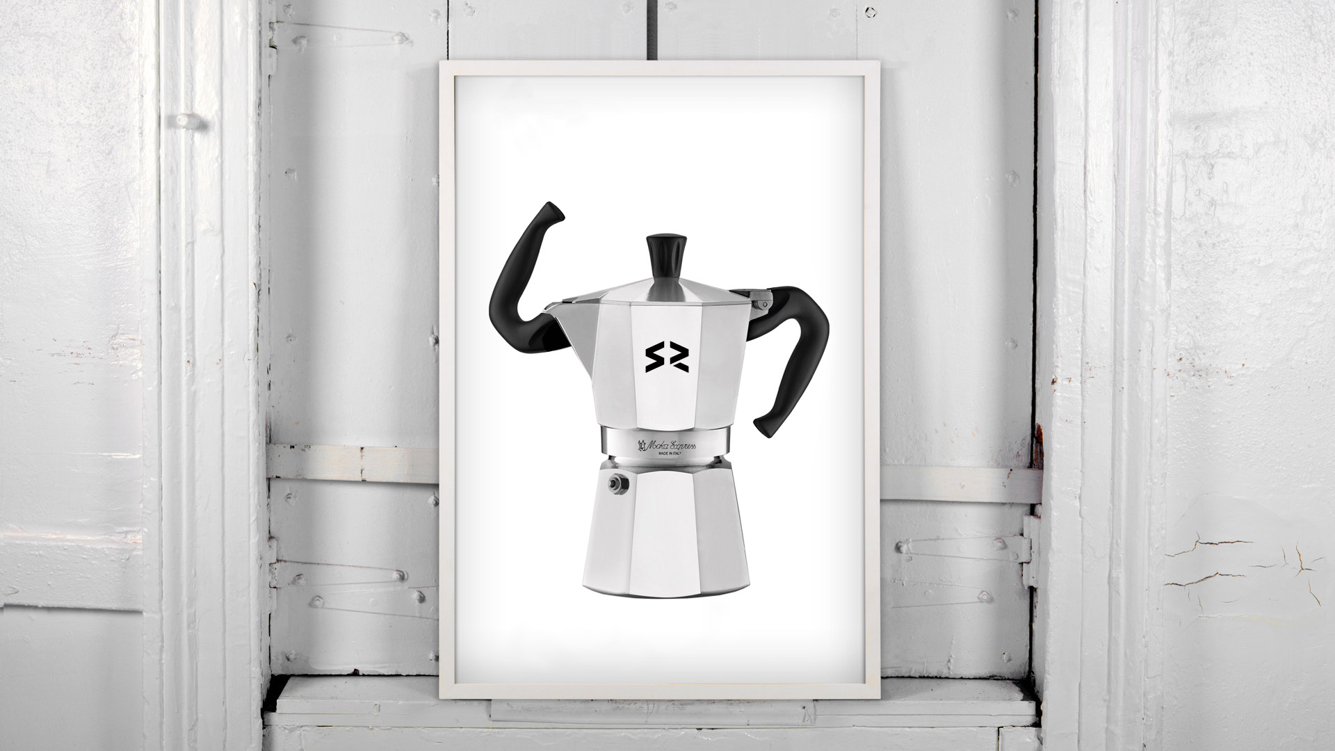
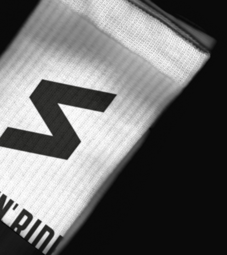
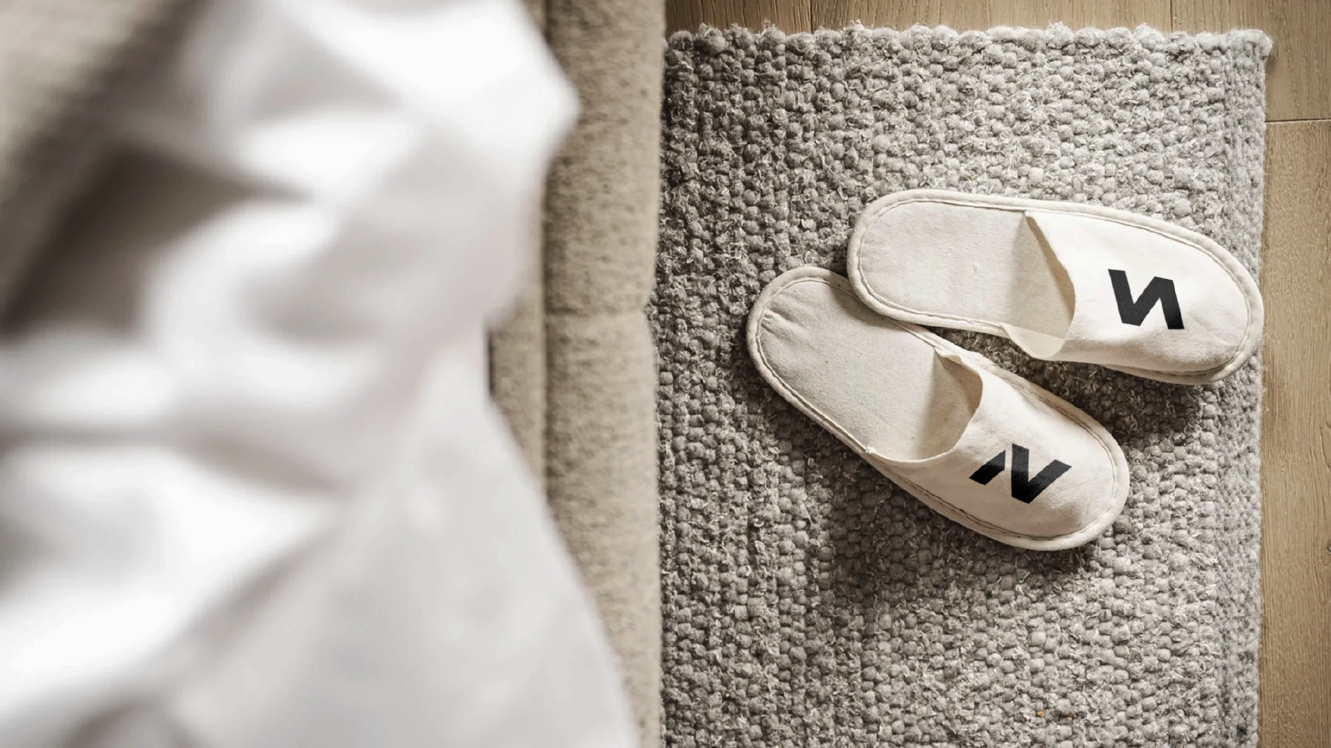
A second logo was created for SLEEP ’N’ RIDE — a new bike-friendly B&B that’s part of the same world. Here, the icon becomes a game of hidden letters: S, R, B, N, M — all emerging from the same graphic structure. With a little rotation and reduction, the system shifts: S becomes R, becomes N. The result is a sibling identity with shared DNA, ready for signage, towels, espresso cups and trail maps.
A small design for a small place doing big things. Built to ride. Made to last.